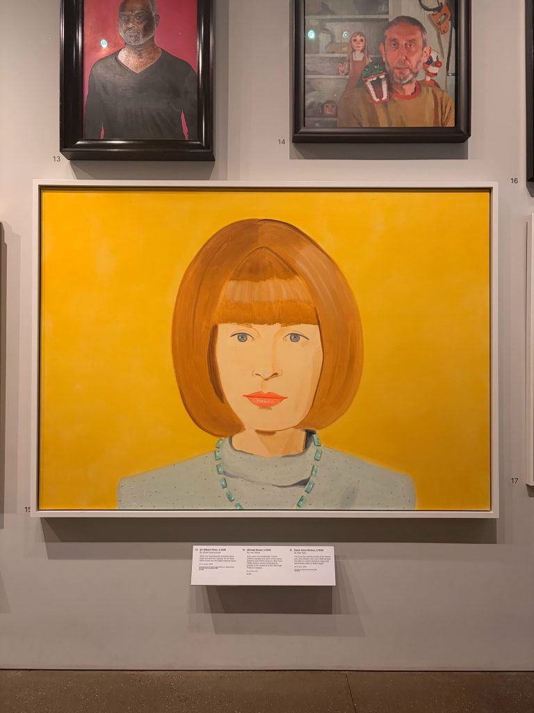
I will be the first to admit that I am not a natural museum girl by nature. I wish I found artifacts from hundreds of years ago precious and fascinating, and while sometimes that’s the case, most of the time it’s not. So, naturally, that means I find art museums to be right up my alley. I believe I could look at a piece of art for hours, being mesmerized by the detail, or color choices, or texture of art, so I was very excited to spend the morning at the National Portrait Gallery. I think pictures and photographs of people are often the most touching way to connect people with art; to see people in raw and real form is something that is very intimate and inspiring, and that’s exactly what the National Portrait Gallery offered to us. I really like this blog post prompt of choosing one portrait specifically to admire and study. As soon as we walked in, we walked along some of the featured portraits on the first floor, and I was immediately struck by a portrait of Anna Wintour, the newly retired editor-in-chief of the fashion magazine Vogue. As a fashion girl myself, Anna had always been one of my idols and someone I look up to professionally and style-wise, and so seeing her in a huge portrait was incredible. However, I was so struck by this specific portrait, not because it was Anna, but how they depicted Anna. The portrait itself was extremely simple and lacked many impressive details. There is a plain yellow background, no details on her clothes (which is an interesting choice for the editor-in-chief of the biggest fashion magazine in the world), and the most surprising detail: we see her eyes. Anna Wintour is famously known for the huge black sunglasses she wears everywhere, and it is rare that we ever see her blue eyes. That is how most people know Anna and recognize that she is she, not some random lady with a bob. When I think of Anna, I think of those glasses being on her face, which is why it is so interesting that the artist chose to make a portrait without them. The sitter’s face and expression is spot on to how Anna is, simply, stern, direct, and a little intimidating, and I am happy to report that is what I felt when looking at this piece, There is not a lot of contrast in this piece, which again I find interesting because we know her as a bad-ass designer who loves contrast in everyday life, and the reason I could see the artist staying away from contrast is to give the viewers a different side to her. This piece very much looks like young Anna, real Anna, and an Anna no one really gets to see, and I am glad the artist made the choices they did to give us this work.