Our day at the National Gallery was successful! After exploring the many rooms full of iconic and beautiful artwork and spending seventy pounds at the gift shop, I left feeling fulfilled. The National Gallery had multiple rooms that included biblical paintings. Many featured the birth and crucifixion of Christ, and some portrayed other stories and figures from the bible such as Samson and Delilah or John the Baptist. I wanted to look at one of the paintings that depicted mythology and Christianity. The painting on the left is by Giovanni Battista Tiepelo and is named An Allegory with Venus and Time. The shape of this piece was different than any other painting as it was in the shape of a huge oval and was mounted from the wall facing down. It depicts the goddess Venus with an angel holding an infant. Though this piece was placed with the other Christian painting, this piece could be perceived as Jesus in the heavens or just something of a mythological symbol of infancy and mortality. I was drawn to this piece because of the colors, details, and blending, however, the face of the baby is what made me stay. This painting and a few others within the museum depicted a distorted baby’s face. At the time, artists were either unfamiliar with an infant’s features, the baby couldn’t sit for long enough, or they just used a grown man’s face on a baby’s body. With such a beautiful piece, whether it be mythological or Christian, even the beauty of Venus couldn’t save that baby’s face.
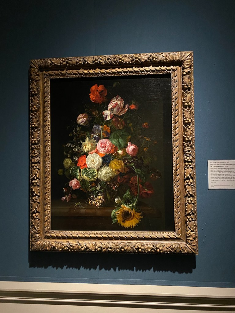
I also focused on the still life paintings within the museum, as a floral still life will always catch my attention. I noticed a beautiful Rachel Ruysch still life titled Still Life of Flowers in a Glass Vase on a Marble Edge. This realist painting pictures an abundant bouquet with a dark background. The colors were vibrant, and the detail was prominent. Like the Tiepelo piece, it has amazing pastel colors and told a story, even if it was just a still life rather than a mythological story. It was so exciting to see such a difference in pieces, especially works with such big names in the Gallery like Van Gogh and Monet. I can’t wait to go back!
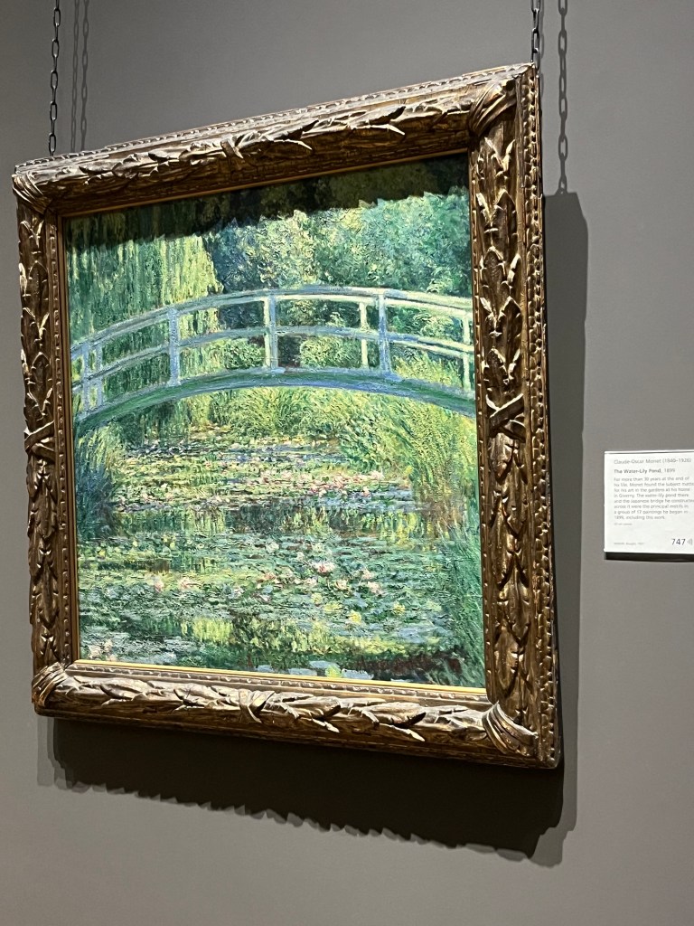
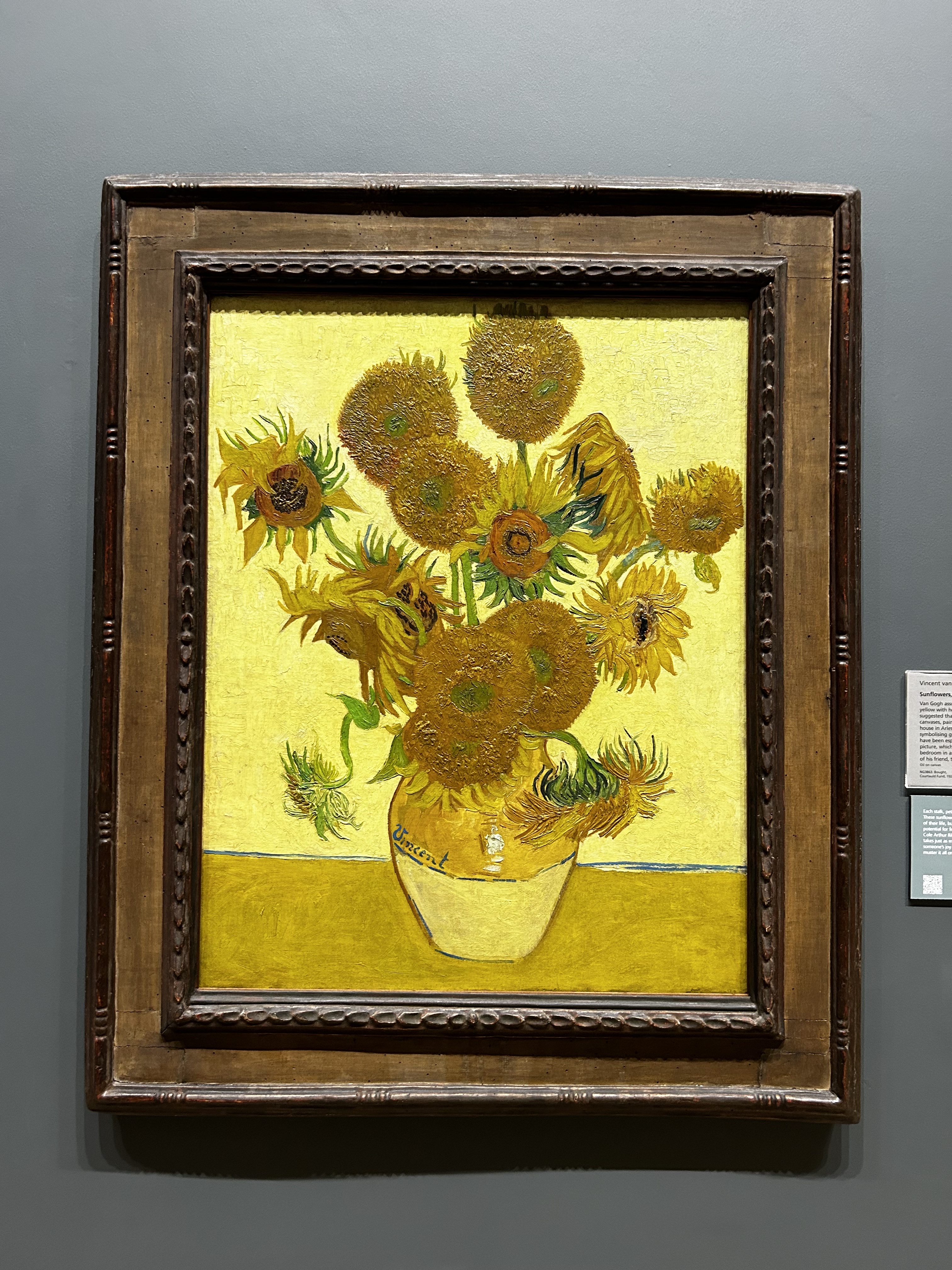
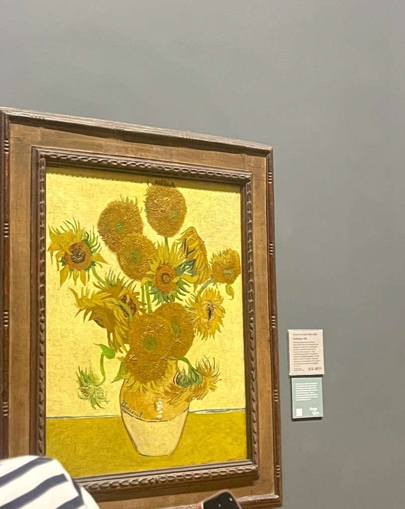
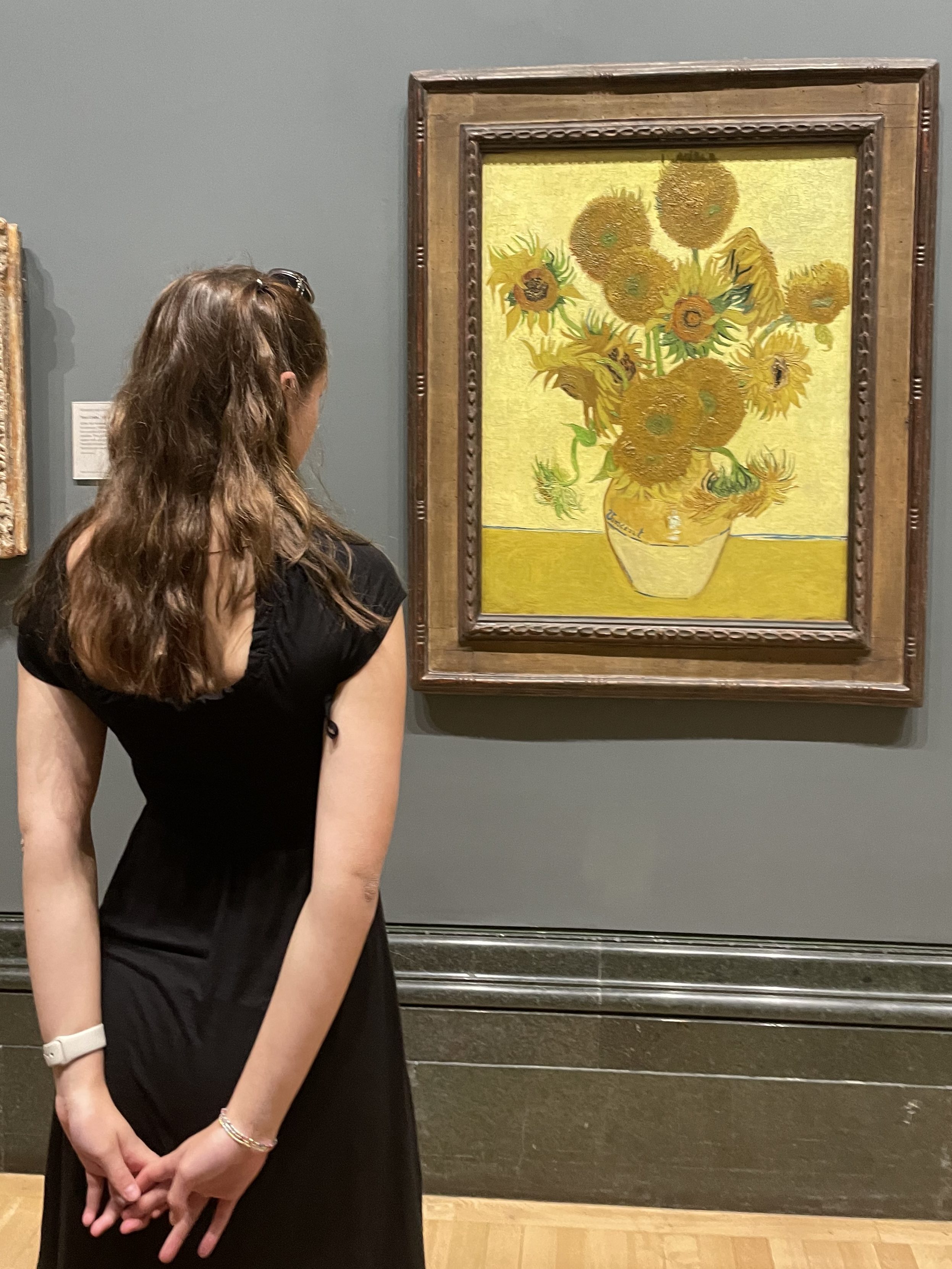
The National Gallery was maybe my least favorite museum we have been to thus far. I think it is the idea that so many similar paintings that all stand next to one another lessen the effect of some of these beautiful masterpieces. Seeing a room filled with only oil paintings makes pieces like Sunflowers by Van Gogh look less intriguing. And that saddened me a bit because I wanted to be so emotionally pulled by the art and that did not happen for me this museum go- around. My most favorite classic painting I think ever is The Water- Lily Pond by Claude- Oscar Monet. I am a woman of the water and seeing the way in which he has sculpted the dimension of the pond makes my heart flutter. The weeping willows to the left side of the painting are probably some of the most beautiful leaves I have ever seen created with oil. The embankment to the right of the painting with the tall grass sweeping over the water is created in a way that looks like wind is flowing over the water. I loveeee this aspect of the painting. Seeing the effects of the wind brings this piece of art to life along with the reflections in the water. The dimension and life Monet can create in his work inspires me as an actor. You can be given a blank canvas (character) and you are the one with the responsibility to breathe life into it and I believe Monet is a master at this.
The second painting I loved seeing in the National Gallery was The Horse Fair by Rosa Bonheur. This painting is almost thirty years older than Monet’s Water Lily- Pond and although both are used with oil paints the technique used by each artist is vastly different. In The Horse Fair Rosa utilizes emotion in almost every stroke. Even the grains of soil at the bottom of the painting are brought to life with visceral emotion by the dust storms the horses and people create. Both paintings use motion to bring about the scenic story. The horses, although stagnant in the paint; you can read the story of a stampede vividly by the brush strokes and imagery Bonheur uses. The biggest difference between these two paintings is the use of still life versus real life. Bonheur depicts motion with people and horses while Monet replicates motion with distorted leaves and water.
Another similarity between the two is the artist’s use of reflection from the water/the ground. Creating reflection in canvas painting is incredibly difficult to do; specifically with oil paints. Oil can easily become muddy and without an exact idea of what shapes you want to create, creating these vignettes must be done by a skillful hand. I find it interesting these artists have completely unique styles of painting while using the same ingredients: canvas and oil paints. Monet uses impressionism to create his worlds. I highly doubt the Japanese garden bridge he constructed in real life was evident with such greens and blues, but in actuality brown or grey. Monet uses his colors to tell his own story while Bonheur paints realistically and wishes to capture the scene before her in strict detail. But as I said before, both utilize reflections in their work similarly. To show what is there and what can be beyond. Monet’s reflections imitate the lilies and grass in a way that make the 93 x 74 cm frame seem much deeper and larger vertically. Bonheur does the same, but her reflections and shadow make her painting look deeper horizontally, like if you step inside her painting you could travel for miles before reaching the end.
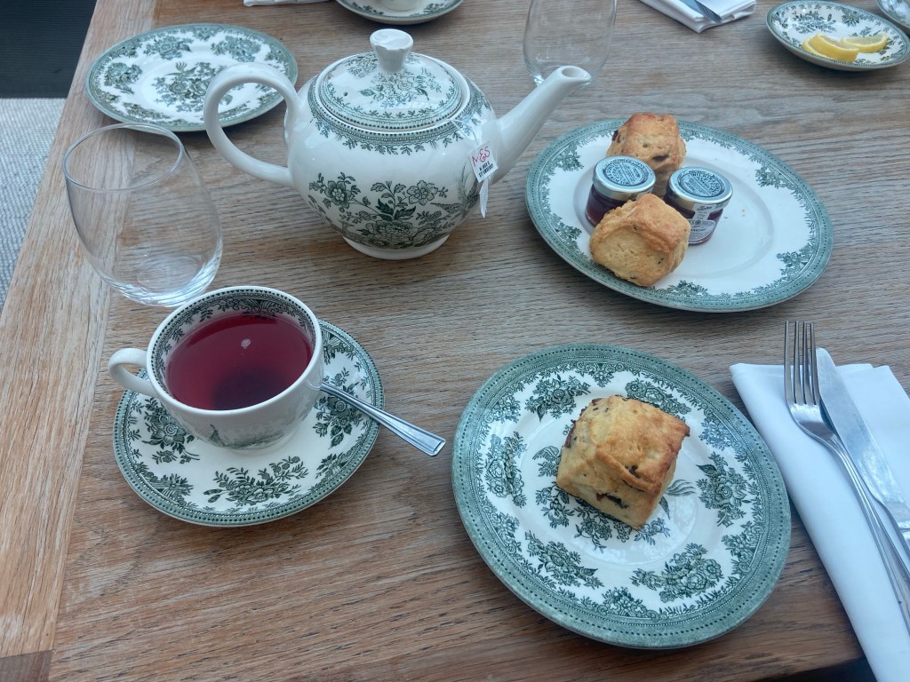
Yesterday, on June 3rd, I spent the day viewing famous and beautiful art in the National Gallery in London. This was the only thing our group had on the agenda so it was a very relaxed day. Once our group was free for the rest of the day, a bunch of us decided to enjoy a picnic in Russel Square park which is right by our hotel. We had pizza and sushi and even held a talent show. Afterwards, ten of us walked to the British Museum to celebrate Alyssa’s birthday with Afternoon Tea. We ate in the upstairs parlor of the Museum and drank delicious Earl Grey tea with clotted cream and scones. It was such a great day to enjoy London traditions such as the many museums and galleries they have to offer, and of course tea time.
I cannot believe all of the famous art works that I finally got to see in person. It is one thing to see Vincent’ Van Gogh’s famous Sunflower painting be discussed in art class or to see a picture of Monet’s Water Lillies on the internet, but to see it in person is a feeling so surreal and invigorating.
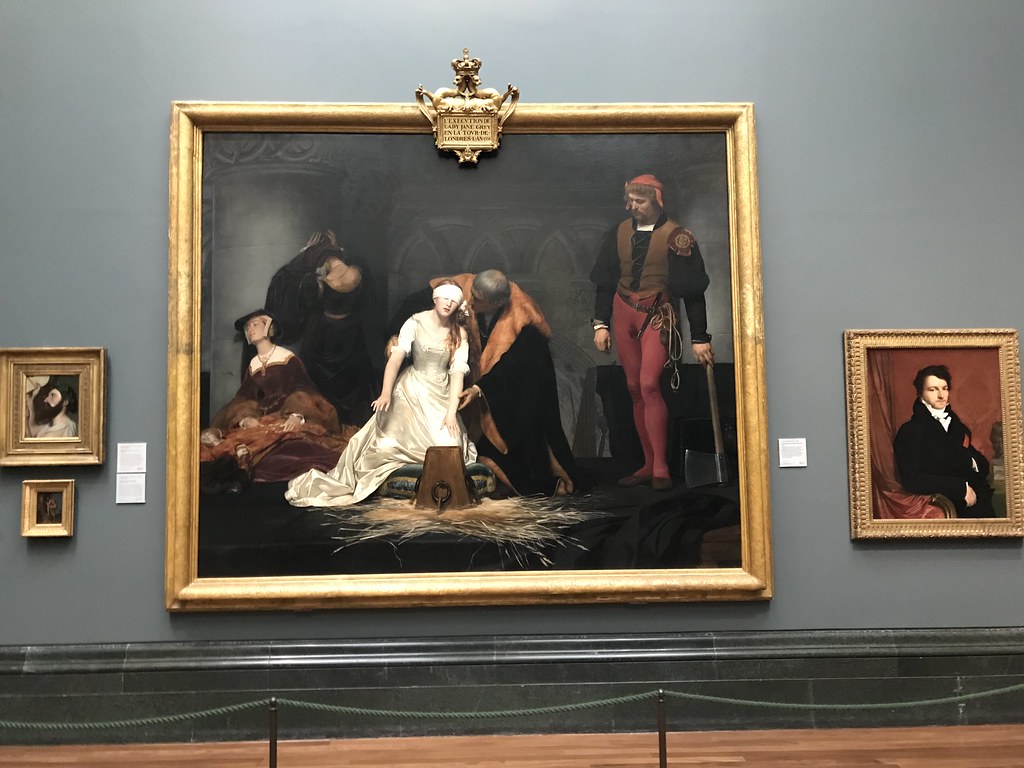
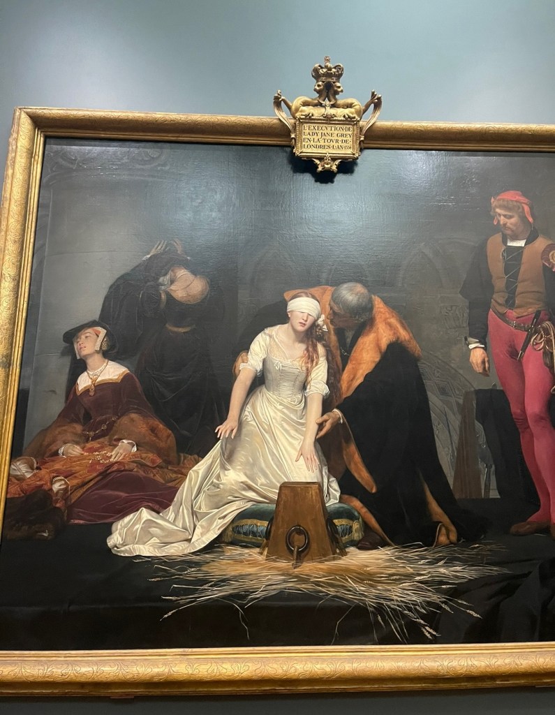
The most exciting moment of my day however was viewing the famous painting of Lady Jane Grey’s Execution. The Execution of Lady Jane Grey was painted in 1833 by Paul Delaroche. Lady Jane Grey reigned as queen at the age of fifteen for only nine days in 1553 until disposed by supporters of the Catholic Queen Mary. Many may recall in a previous blog post of mine that she was beheaded in the Tower of London. The French painter, Delaroche was famous for his scenes of British royalty, especially those who were doomed or dying.
As I made my way into a giant hall to see the painting displayed in a gigantic frame that took up the entire wall, I sat at the bench that laid in front of it. The painting depicts the moment that Jane, blindfolded, is being assisted to lay her head upon the block for the executioner. Many may remember as I mentioned in a previous blog post, that Lady Jane Grey was executed in the Tower of London. While imprisoned in the Tower, Jane was attended by ladies in waiting, one of whom was the nursemaid of her infancy. Two ladies in waiting are depicted in the painting, showing their grief at the event which is about to take place.
I stared at the painting with both awe and sadness for a good ten to fifteen minutes, until I approached the image more closely to study smaller details that I may have overlooked from far away. As I studied the painting, I began to make connections between it and a previous painting I had viewed in another room which is called The Dead Christ Mourned, painted by Italian painter, Annibale Carracci in 1604.
The painting shows the dead body of Christ laid out in a white loincloth, with his legs on a white shroud and his head resting in the lap of his mother, the Virgin Mary, in her characteristic blue robe; overcome with emotion, she has fainted. The mother and son are accompanied by three other figures. Mary Magdalene, with red hair, is kneeling to the right, wearing a red robe and elaborately embroidered yellow cloak, with her hands raised in anguish. They are accompanied by an older woman, standing in a dark green robe to the rear, reaching out towards a younger woman in green, blue and red who is kneeling behind the Virgin Mary to support her.
One of the main similarities that I detected between the painting of Lady Jane Grey and Jesus Christ is that they share themes of innocence, death, and mourning. Even the main subjects of each painting are depicted similarly. Both Jesus and Lady Jane are wearing white to represent their innocence and purity. They also share the similarity of being prominent figures of history. Jesus Christ a king has been crucified; Lady Jane, a queen is about to be executed. Both figures in the paintings revolve around the idea of death.
Not only are there similarities between the main subject of each painting, but also between other background figures. Jesus and Lady Jane are mourned by women in each of their paintings. Jesus’s mother has fainted just as Jane’s lady in waiting has. There is a deep sense of grief in both the women. Jane’s lady in waiting holds Jane’s necklace in her lap, grasping onto the last thing she has left of someone who is like her own child. Mary holds Jesus in her lap, unable to let go of her grief and her son. The other lady in waiting is so distraught much like the other women in the painting of Jesus. Unlike the other women in The Dead Christ Mourned, this lady in waiting’s face is not revealed for she is so stricken with grief that her face is turned against the wall with her head tilt downward to reveal her exposed neck. Having her neck exposed reminds viewers of the inevitable fate of Lady Jane Grey to be beheaded. The three concerned women in the painting of Jesus have halos around their heads to remind viewers of the fate of Jesus who rises again in three days. It was interesting to see how other background figures served as symbolic representation in the paintings in such similar ways.
Both paintings emotionally moved me, giving me similar and different feelings about the pieces. I think these paintings depict grief very well. I loved making the connections between the two and digging deeper to see how small details could symbolize significant meaning for the paintings. I think what really stirs my heart about these paintings is that they don’t just show grief, they show the mourning of child loss. Both the Virgin Mary and the lady in waiting who had been with Jane since infancy must have felt tremendous grief witnessing someone they cared for be executed. Their fainted and distraught faces being practically identical in expression shows that the loss of motherhood is a universal feeling that many in the world have experienced regardless of their good works or their royal status. It can go without being said that both painters, Paul Delaroche, and Annibale Carracci have beautifully depicted the masterpiece of mourning.
We walked to the National Gallery today, which I wasn’t initially excited about. But, as I walked through the hallways, I increasingly got more excited. As I came across paintings by VINCENT VAN GOGH, MONET, AND LEONARDO DA VINCI, I realized that this was a very good day. Surprisingly though, I won’t be talking about these famous artists as they weren’t necessarily my favorite experiences of the day.
As an artist myself, I don’t think it really hit me that I was seeing an original painting in front of me by artists that I was always fascinated by. I actually plan to go back to the gallery as I didn’t get to explore as much as I probably should.
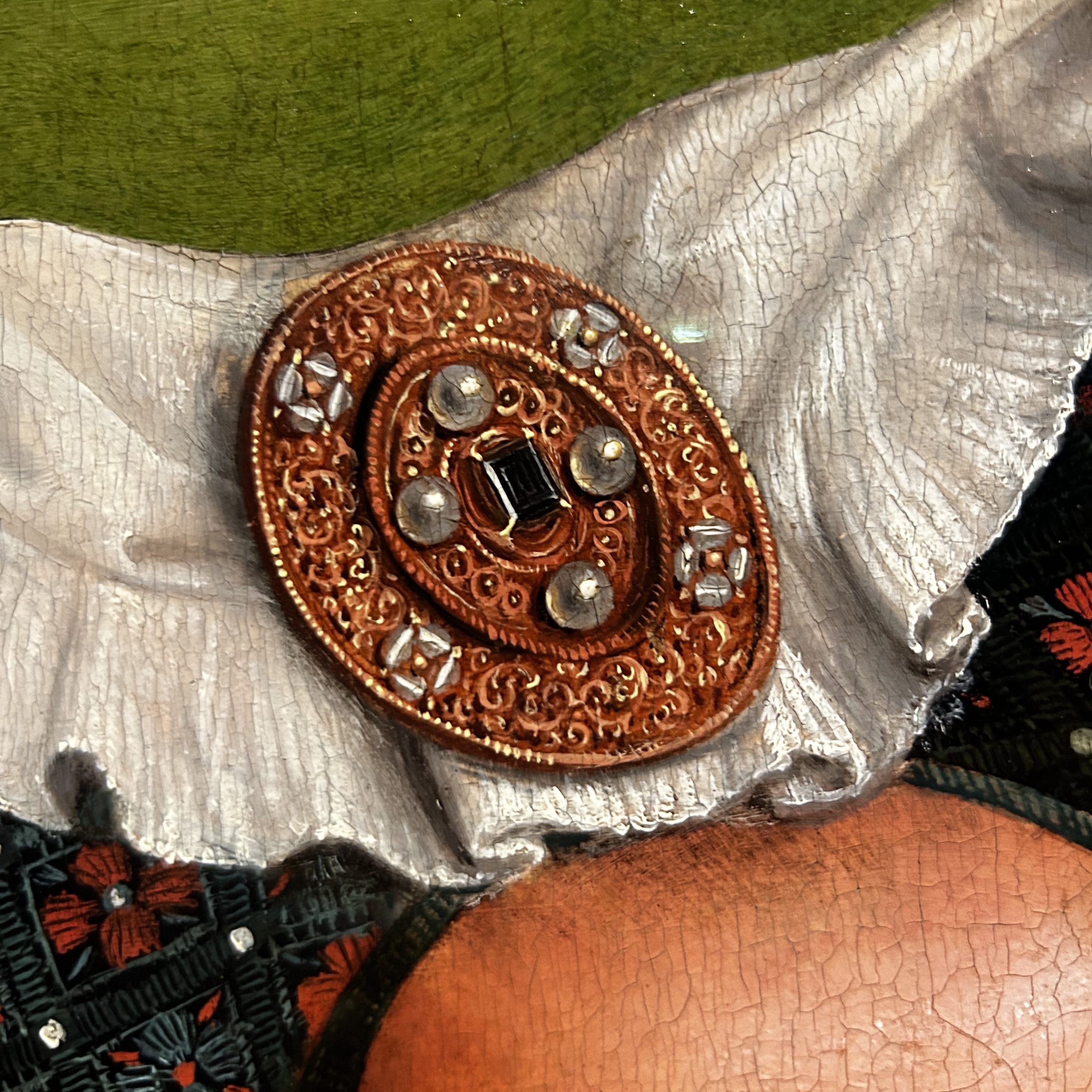
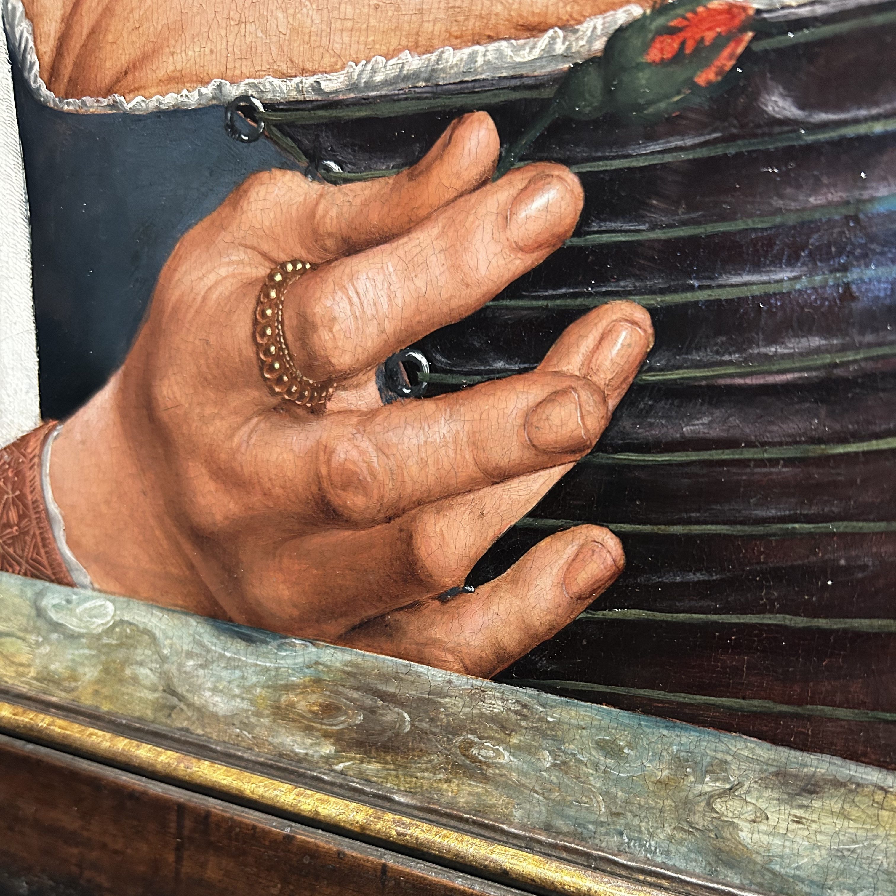
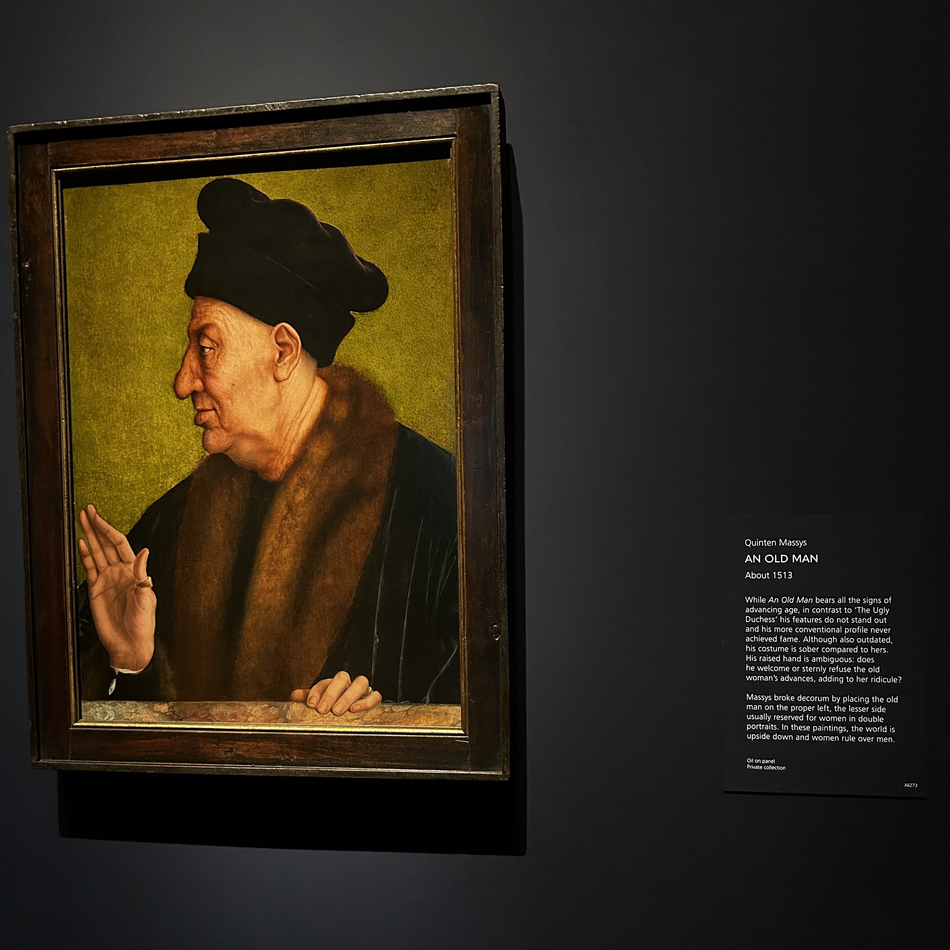
I did come across a new exhibit called “The Ugly Duchess,” which had a very interesting story. There is a painting by Quinten Massys from 1513 that is famously referred to as “The Ugly Duchess” while the painting is actually titled “An Old Woman.” After reading more about it, I learned that the painting isn’t based on any specific person at all. The painting is to represent an old woman that is offering a flower as a romantic gesture. The clothing and the headpiece are very extravagant and revealing, but in that time period, they were also very outdated, which is meant to be comical and satirical of a woman being “ridiculous.” Not only was there a painting of the old woman in oil on canvas, but a drawing in the original sketchbook when it was first drawn. But, along with the old woman, is “An Old Man” painted by the same artist. This painting is set up so the man in the painting is facing the old woman with his hand raised. The question is, is his hand raised in a welcoming gesture or to signify his turning down of the old woman’s advances?
These paintings had a piece of glass over the original work, so I could stand extremely close to them. The attention to detail and the ability to make the smallest adjustments or strokes of paint made the painting seem so realistic. Even now, I can’t get my head around how Massys painted such a realistic-looking headpiece and jewelry.
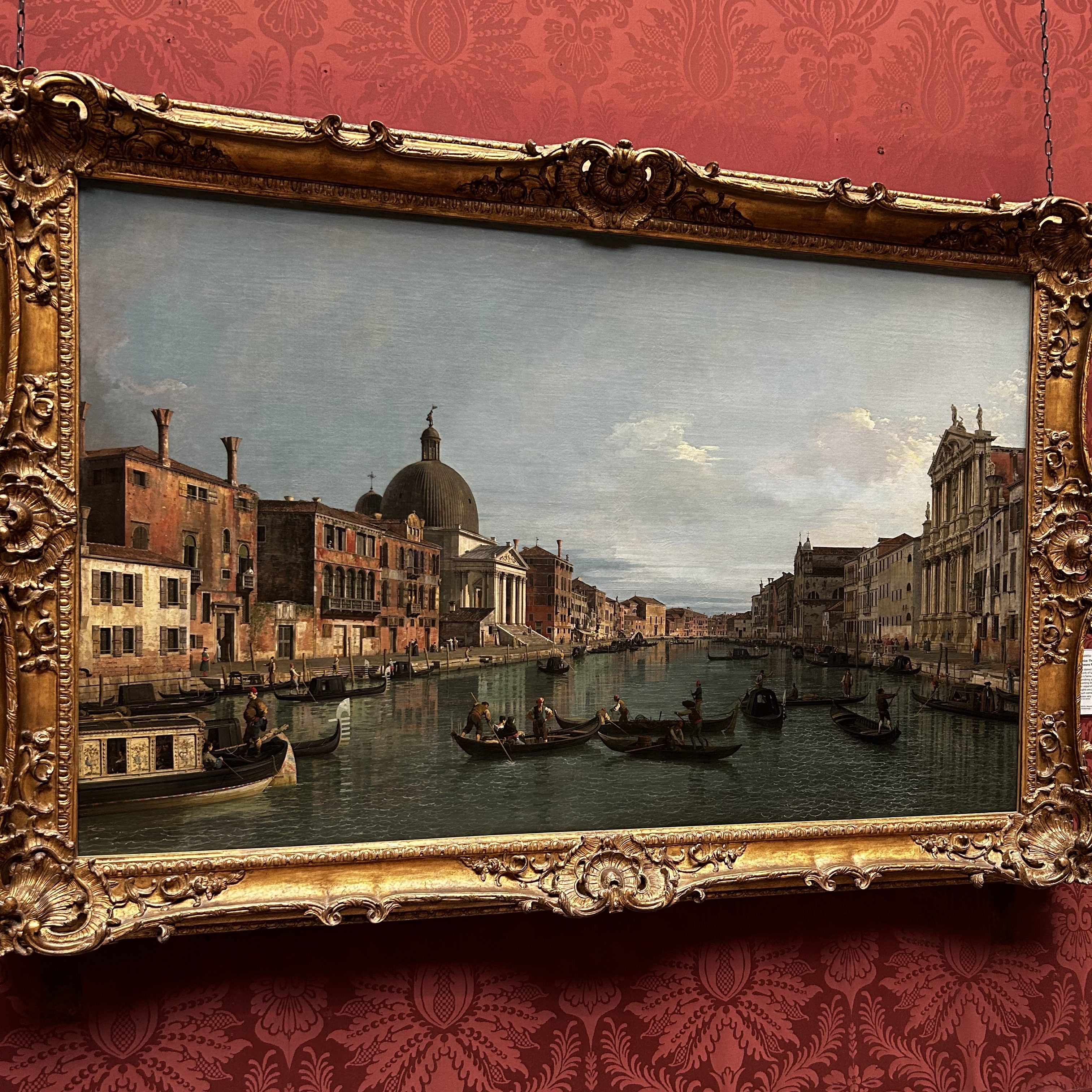
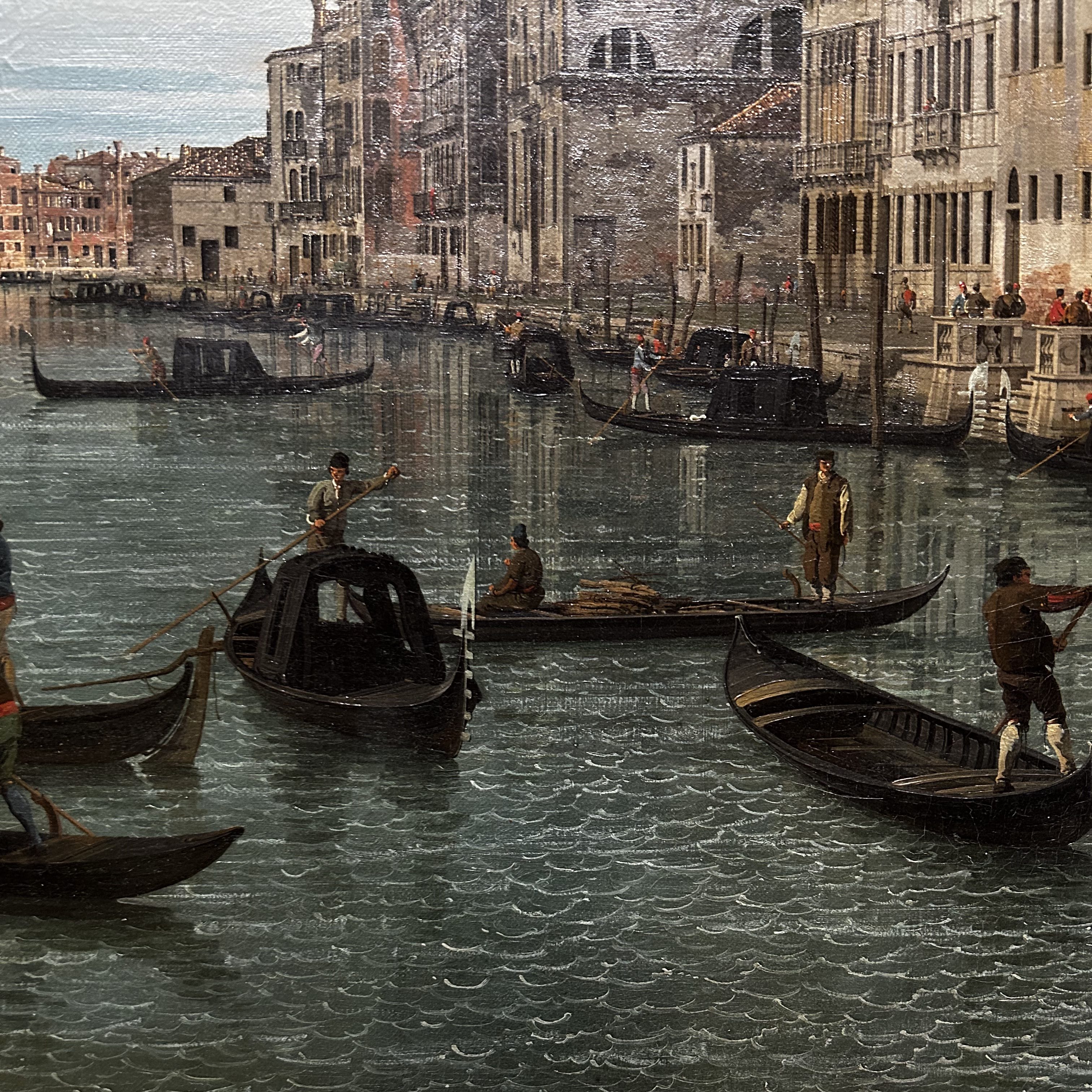
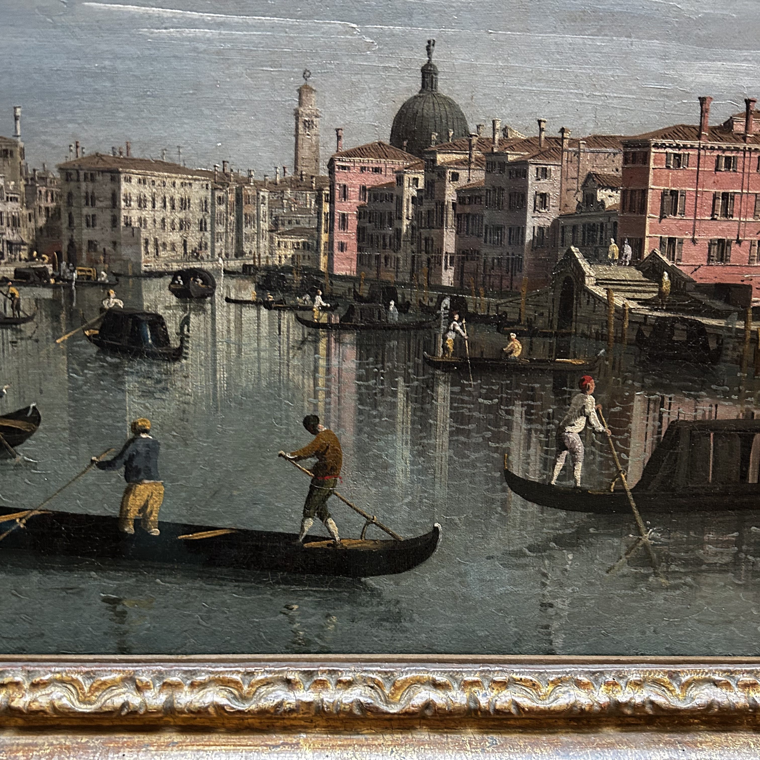
While browsing through the gallery, I came across a section of oil paintings of Venice, Italy – more specifically – a location near the canals. There are gondolas in nearly every landscape, and I loved seeing different artists create basically the same scene. Some artists painted the sun in a beautiful blend of yellows, while one specific artist used lines to resemble the light coming from the sun (which I found kind of goofy, to be honest). Other paintings showed very intricate scenes of figures reflected on water or very intense waves carrying a ship.
But my favorite thing 0f these paintings was Canaletto’s “Venice: The Grand Canal with S. Simeone Piccolo.” Canaletto’s pieces were all of the canals in Venice, but specifically, the way he painted the waves caught my eye. The reflections of the waves weren’t as intricate or “realistic” as I would have assumed they would be. After seeing many paintings portray water with beautiful reflections and intricate waves with massive detail, I wasn’t expecting little ripples in the water that remind me of squiggles used in children’s drawings.
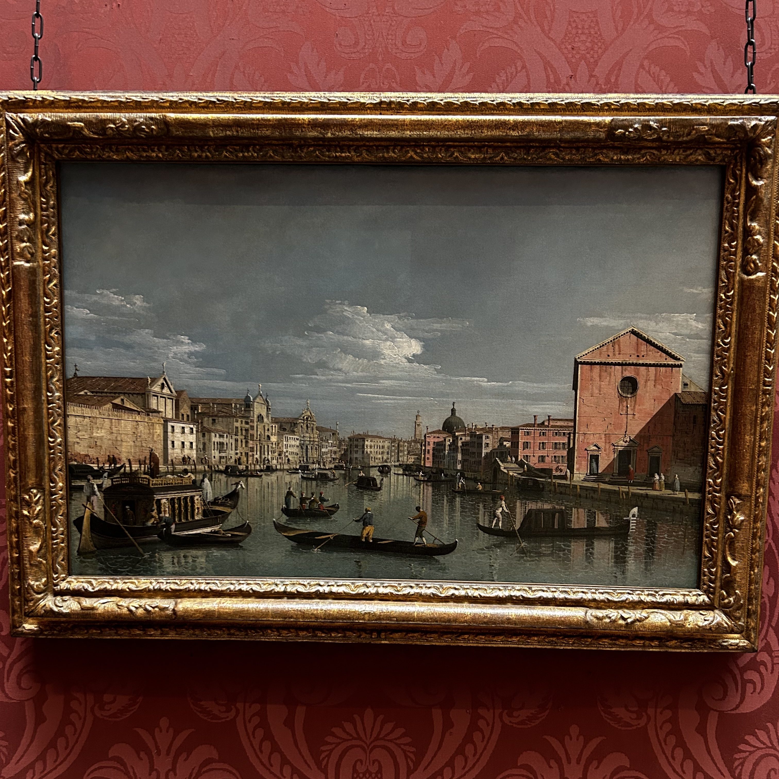
What I found most interesting, though, was another painting by Bernardo Bellotto called “Venice: The Grand Canal facing Santa Croce.” This painting was created around 1738 and also has similar patterns in the waves of the Venician canals.
It turns out, Bellotto is Canatello’s nephew and took a lot of inspiration from his uncle’s paintings. I would have never known the family history of paintings, let alone realize that this similar style of painting was influenced by family, not just the style of a time period. I think it’s amazing that two members of a family are displayed next to each other, let alone at a national gallery among household names like Monet and Van Gogh. I love that even among some of the greatest artists, I am still learning little details about less commonly known artists that lived almost 300 years ago.
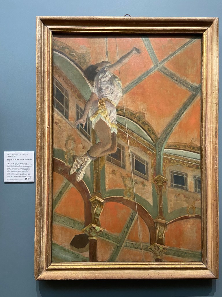
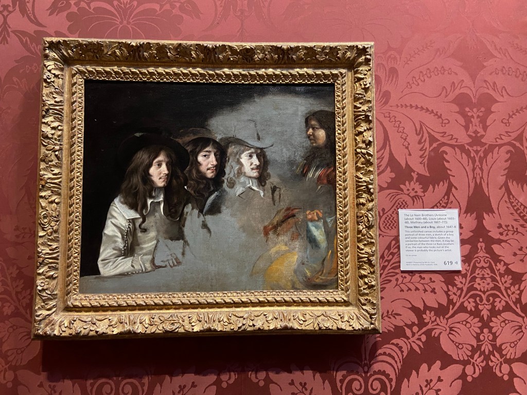
Yesterday we began our day with a walk toward Trafalgar Square and the National Gallery. We were asked to write our blog comparing and contrasting two different paintings from the gallery that moved us. I picked Edgar Degas’ Miss La La at the Cirque Fernando and the Le Nain Brothers’ Three Men and a Boy.
I have always loved Edgar Degas’ work, and I was specifically intrigued by this piece of his. Most of his work is of ballet dancers at eye level, but I enjoyed the viewpoint this painting gave me. There is a lot of life and movement that occurs in this painting, and the bright colors is different to the normally muted tones of Degas’ other works.
Miss La La at the Cirque Fernando, Edgar Degas
Three Men and a Boy also showcases the human figure, but this was done in a portrait style instead of an “action shot.” I loved the fact that this painting was unfinished because you can begin to imagine how the painting was created in the first place, and it leaves room for interpretation of what the painting would look like finish. Personally, I think the painting is beautiful the way it is, and you get a different experience in this one than the Degas painting. The Three Men has much more muted tones than Degas, and the Three Men draws you into the painting not because of the movement but because of the intense gaze that shrouds the center of the canvas. The middle figure is said to be the artist himself, which is why he stares so intently at the viewer, but this look is what brings so much life into the painting for me. I couldn’t stop staring back at the mysterious man in the photo.
Three Men and a Boy
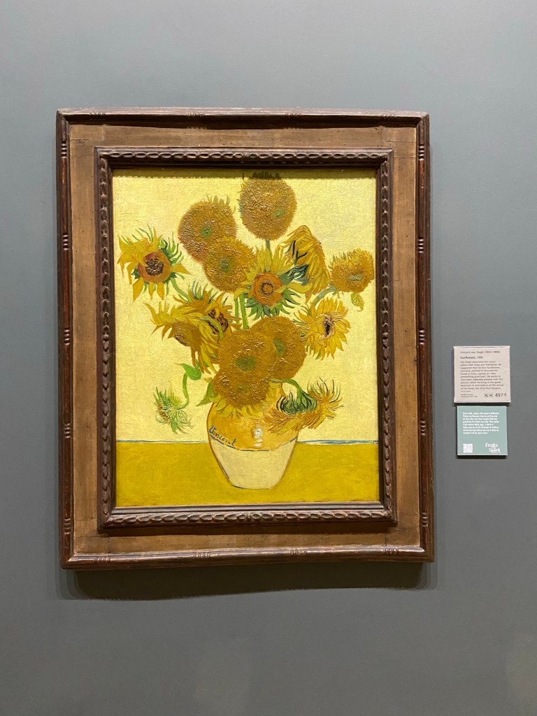
I’ve also decided to include Van Gogh’s Sunflowers in this post because it’s one of my favorite paintings. I think it’s amazing how something so positive and beautiful was created by a man who was suffering from intense depression. Even through his storms he was able to create something that showcases the beauty in life and provide a little bit of hope to those who see it.
Sunflowers, Vincent Van Gogh
After the art gallery, I got to take part in my first cream tea at the British Museum for Alyssa’s birthday (yay!), and it was delicious. I’m looking forward to the day I will partake in high tea. Honestly, tea time doesn’t happen as often as I thought it would in London.
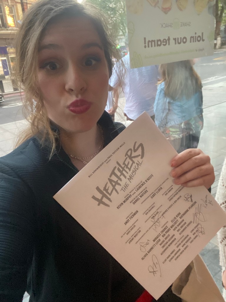
Today I spent most of the day with Allie and Alyssa going through bookstores and picking up a few discounted architecture books. I ended the day with an AMAZING production of Heathers the Musical, and we waited outside afterwards to get the cast to sign our playbills. It was a 9.8/10 show because some of the accents were weird, but the set and singing was some of the most beautiful I have heard and seen on this trip. This show made me really happy and gave me intense butterflies.
I had a very good time at the National Gallery the other day. It felt far more reasonable to enjoy the paintings at this museum than at the Tate Modern because it was clear that effort was put into every single one of them. I think that the names of each painting at the National Gallery were lacking severely, I mean, “Portrait of a Boy aged 11” c’mon I could give a million better names–but here are ten
1 Dashing lad
2 What Does He Know?
3 Portrait of my Sleep Paralysis Demon Who Happens to be a Young Boy
4 Evil Baby
5 Eat This Painting
6 If You Can See This Painting Seek Medical Help
7 Paddington as a Human
8 He appeared to me in a Dream
9 This Boy Has no Name
10 Please Put this Painting in The National Gallery
I am really good at naming things. More people should ask me for help.
I think that the painting that stood out to me the most was Saint George and the Dragon by Paolo Uccello because I had learned about it in my Graphic Novels class a few semesters ago when we had a guest speaker come and show us the power of reading images. Humans are able to place emotions and feelings into images and convey complex ideas just through the visual medium. In this painting, we see that the Wyvern has spots on its wings that look like eyes, butterflies have similar patterns on their wings to ward off predators. Based on the wings we can discern that this dragon is to some degree prey. We also see that the Knight is riding in on a white horse and behind him is a dark storm–there is a storm coming– the clouds twist in unnatural patterns and swirl almost like magic making the knight seem all the more powerful. The woman in this painting is remarkably calm given what is transpiring around her. The woman seems to have the wyvern on a leash, insinuating that she is in control or ownership of the beast.
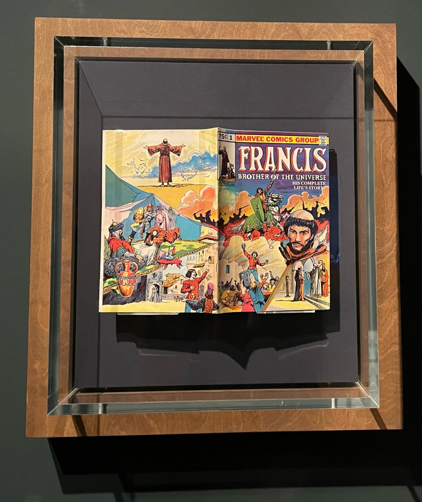
Another piece I felt really spoke to me was the whole Marvel comic they had on display about Saint Francis. As someone who lives and breathes comics, I think that this exhibit was made for me to talk about. So having not read the book and only being able to see the cover and back let me analyze this. You can see that this book was approved by the Comics Code Authority because it has that little stamp in the top right corner, you can also see that the cover art spreads to the back as well which is unusual as the backspace is typically reserved for ads. It can also be deduced that this comic, while published by Marvel, does not take place in the mainline Marvel universe as it has since been confirmed that Jesus Christ is a Mutant in the Marvel Universe and this comic seems a bit more grounded in real-life beliefs. The framing of this cover is very interesting as well as your eyes are instantly drawn to the big head in the middle of the page then you look at the horse and battlefield then your eyes go down the celebration then finally to the pope frame. And that was not even counting the three panels on the back cover which borders all draw your eye to the center of the front cover.
Experiencing visual art is something I wish everyone had the opportunity to do because it provokes introspection through the somewhat passive act of observation. I am a person that enjoys reading poems and such because I achieve a similar path to self-reflection when consuming that media, but sometimes art can take me down that path when my brain does not have the energy to visualize and connect words to an image in my mind.
I was a bit nervous to view the art in this museum when I first explored the rooms because I did not think I would be able to connect to it like I could with modern art. I was not raised in a religious household, so my Biblical literacy is lacking. Even without the background for these pieces, I was happy that I still found myself able to enjoy and appreciate the beauty of this art and experience strong emotions viewing it. Someone asked me what my favorite art to view was (between modern and classical), and I could not decide because both experiences were pleasurable in different ways. I think modern art allows me to question and understand my experience living now, but classical art pushes me to understand other people, especially those before me and realize what aspects of society have stuck around, and what aspects we have lost. That is a simplification of my experience in the two, but I think it sums up the major pieces going through my mind. A main thing I noticed and appreciated about society is how long domesticated dogs have been around; I knew they would have been with people for a while, but seeing dogs in art really made me think about it.
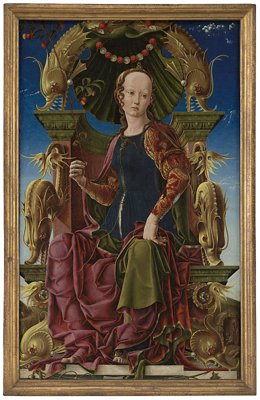
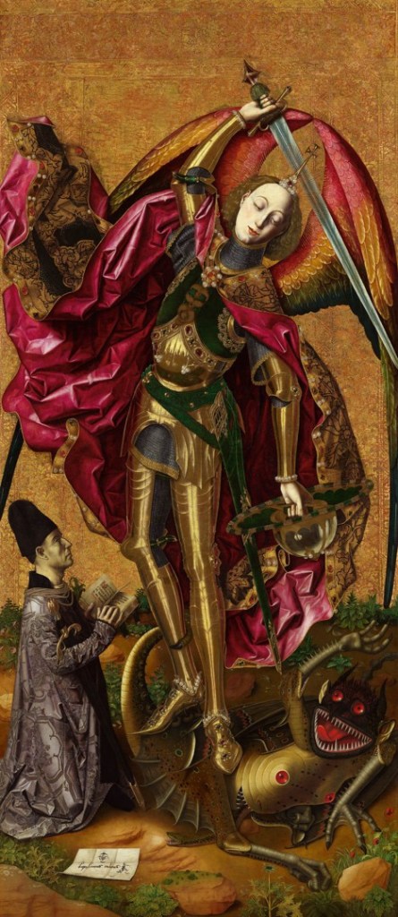
There were many pieces in this museum that I found intriguing, but the two I thought would be most interesting to compare and contrast were “A Muse (Calliope?)” by Cosimo Tura 1455-60 and “Saint Michael Triumphs over the Devil” by Bartolomé Bermejo 1468. The thing that struck me most about these paintings is the pairing of gold bodies and red eyes of sharp-toothed creatures. I love how intimidating the color choices make the picture. The main difference between the two paintings is what they depict. Bermjo’s painting has images of conquering and war, while Tura’s depicts a woman who already has power. Overall, I just really enjoy how unsettled and safe these paintings make me feel. The National Gallery was an excellent museum, and I would love to visit again sometime.
One painting that really affected me was The Execution of Lady Jane Grey. I wrote about her on my Tower of London blog, and seeing this painting after learning her story was emotional. She was the shortest ruling monarch, only being in power for 9 days as she was kicked out by supporters of Catholic queen Mary and sent to prison, being executed soon after. It is hard to see a young woman who hasn’t done anything wrong get murdered just to appease those with a higher social standing. Women were treated as a symbol rather than as people and while it’s hard to see it was a truth and sometimes still is a truth in human society.
I also really enjoyed seeing Van Goghs Sunflowers. I have seen this painting online so much, so seeing it in real life was very powerful. I love and admire Van Goghs art style and how it shows his perspective of the world. It is inspiring seeing him paint sunflowers and use them as a symbol of hope and happiness even though he was in a dark place himself. It was said they express an “idea symbolizing gratitude”, which really stuck with me. Every little flower is different and unique and it reminds us to be grateful for everything, no matter small.
Overall, our trip to the National Gallery was enjoyable and I’m glad I got to see such important pieces of art history! It was a great way to start off my birthday. I get a lot of value out of absorbing art in different places, as I find it is one of the best ways to connect with different cultures and communities. I really appreciate how accessible art is in London and I hope to be able to see more before I leave.
We walked what seemed like forever to the National Gallery, but it was such a nice and sunny day, so seeing Trafalgar Square was worth the trek.
We got to see Van Gough, Monet, and Picasso all in one museum (National Gallery)! WHAT?!?!?! In-freaking-sane!!!
We had a little picnic in Russell Square Park for Alyssa’s b-day, got some gf pizza (it was yum but the garlic sauce was mid, I’m still on a garlic sauce search. The sauce makes the pizza and you quote me on that)
I conveniently got pizza sauce on the one inch of white of my dress, that wasn’t covered by a napkin. RIP to the new Camden Market dress…tide pens/wipes to the rescue!
We found ice lollies and jolly rancher sour lemonade gummies, both were delicious! And we soaked up some more time in the sun.
Afternoon Tea at the British Museum, I had mango and strawberry tea…delicious! With some yummy pastries and of course scones and clotted cream.
I had the perfect amount of time for a power nap once we got back from tea (45 mins on the dot).
After the power nap we rallied for some games, cake, blog post writing, and usual shenanigans to kick off Alyssa’s birthday celebration.
The highlight of this was Alex shoving balloons up his shirt, pretending to be a sorority girl, practicing his stage combat, and a few rounds of crazy competitive Uno.
My two favorite paintings at the National Gallery were Monet’s Waterlilies; The Water-Lily Pond, Water-Lilies, Setting Sun and Water-Lilies. Of course with honorable mentions to Van Gough and Picasso. These paintings instantly drew me in as I had a childhood connection to them. We painted them in an art class when I was in 1st grade and then again when I was older (I can’t remember the age). I’ve never seen these paintings in person before, and getting to see how Monet uses the paint to perfectly blend together water was a magical sight. The Water-Lily Pond was the painting that I was most looking forward to seeing and it was the one that I have painted the most. What can I say, a girl is a sucker for a bridge with her favorite flower, I really wish I could just live in that painting some day.
Monet’s original collection of water lily paintings is 250 paintings and is capturing his water garden that he created, himself at his Giverny estate in Normandy. In the series he painted various parts of his garden during different times of the day and in different lights. All of Monet’s paintings have such a dreamy feel to them that almost make them feel abstract, and that you as the viewer are being transported to a magical secret garden.
The Water-Lily Pond, Monet uses long strokes of his paintbrush to show the flowing water that is under the bridge but his lilies are short little dabs of his brush and almost twisted globs of paint to form the flowers. The flowers themselves contrast the water but so does his technique of painting them, even though there are no specific outlines that separate the flowers from the water, giving the painting more of a blurry abstract feel. People have speculated that this is due to Monet’s developing cataracts at the time, that he wouldn’t be able to form the outlines that are normally there. Waterlilies, Setting Sun shows the opposites on the color palette as it focuses more on darker hues such as dark green and blues contrasted with the sunset that is reelected in the water, showing pinks and oranges.
From my understanding and from what I have read/seen from other museums (pictures of other museums lol) they typically have Monet’s waterlily paintings in progress from day to night or night to day. But at the National Gallery they had it in an order that I had never seen before. Which in my opinion made it hard to fully grasp the concept of light progression that Monet was trying to go for, on top of having not having enough space in my opinion to house these paintings. I felt like I was being rushed through a line, just to take a photo of the paintings and then move on. I had no time to really look at any of the more “famous” artwork and really take it in, which was disappointing in my opinion. I wish I would have gotten a few more moments/breaths to just take in the artistry that was on display.
On June 3, we only had one item on our agenda: the National Gallery. The outside of the building is currently being restored but the gallery itself is open to the public (for free!). There were so many paintings to see in various rooms. I tried to take some time to truly “appreciate” some of the art, lingering to take in all the details, but was still only in the museum for about an hour. It was a nice walk from the hotel to the gallery, which sits on Trafalgar Square. On the way, we saw the theatre where Six! plays. I cannot wait to see it later this month.
There is currently an interesting exhibit called “My Reality is Different” at the gallery. The exhibit is a video created by Nalini Malani, the first National Gallery Contemporary Fellow. For the video, Malani has taken paintings from the National Gallery and the Holburne Museum in Bath and animated them so that viewers will hopefully see them in a new life. The video includes a voiceover by a friend of Malani who is portraying the Greek prophetess, Cassandra. The walls leading into the room where the video is viewed had excerpts of the narration. “Who will find a voice again, and when?” is the excerpt that stuck out to me the most.
Despite not spending an excessive amount of time at the gallery, I still saw some amazing pieces of art. There were a handful of van Gogh’s works including on of the many sunflower paintings he did. The gallery also has some Monets, just to mention two of the most recognizable artists in the vast collection.
Most of the paintings can be put in one of four boxes: Christian themes, Greek/Roman mythology, portraits, and landscapes; of course there is some still life painting thrown in for good measure. A lot of the art can also be considered realism. There is not much question of what any of the artwork is actually portraying.
The first piece that truly caught my eye was “The Rape of Europa” painted between 1637 and 1639 by Guido Reni (Europa is one of the many women from Greek mythology who caught the eye of Zeus. To “get it up” with Europa, Zeus transformed himself into a bull and transported Europa from her home in Asia Minor. And yes, Europe is names for Europa.).
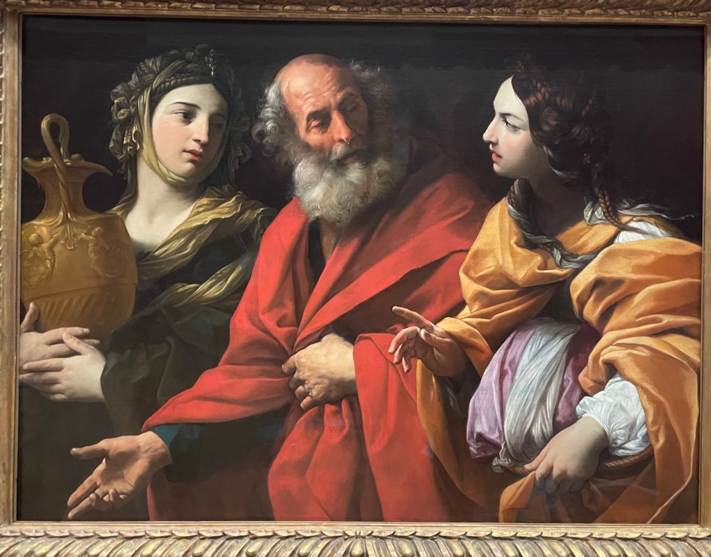
For academic purposes, I will also be looking at Reni’s “Lot and his Daughters leaving Sodom” which was painted roughly twenty years prior. At their core, both the paintings have similar subject matter. Mythology and Biblical paintings are often seen as adjacent when in comes to subject. Both paintings are also oil on canvas (I’m not sure if I saw any paintings that are not oil on canvas). Reni employs the same style for fabric in both paintings. This is most apparent looking at Europa and the daughter on Lot’s right, particularly since this daughter is draped in a similar orange to Europa. I was surprised to see how far apart these two paintings were created as the skill and stylistic choices are so similar. A strong contrast between the two artworks is that “The Rape of Europa” is much brighter than the scene from Genesis. The scene from Greek mythology is set against a bright blue sky with a sweet looking cherub (I’m assuming Cupid since: bow and arrow) almost hanging there translucently. Europa herself is clothed in bright pink and orange. Meanwhile, Lot and his daughters are placed on a simple black backdrop in muted tones. It is amazing how color theory works because it seems like the orange in the two paintings is the same yet due to their surrounding colors they take on different hues. It is also how neither painting seems flat, the people seem separate from the background, yet the rippling water in “The Rape of Europa” does not seem to have movement.
After the art gallery, I headed back to my accommodations for a while before heading to my first afternoon tea! At the British Museum, I had strawberry & mango tea and a scone with clotted cream and strawberry jam which was very good. I will have to go back to the museum for actual perusal of the treasures which lie there.
My roommate, Madison, and I after tea
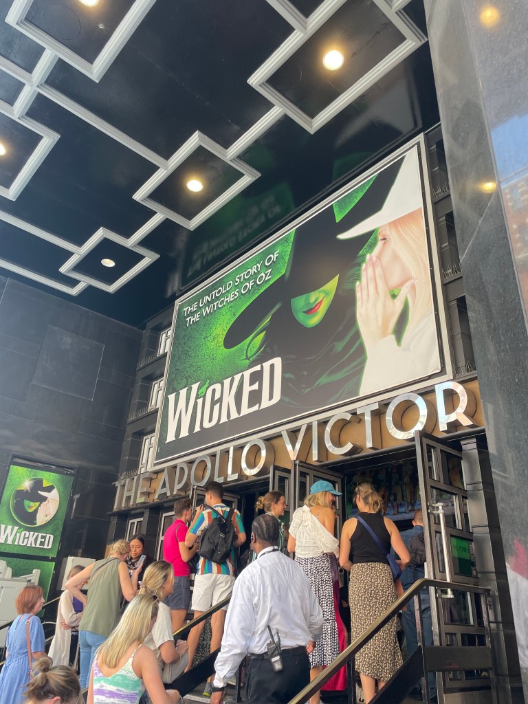
Then June 4 for my free day, I saw my seventh play of the trip: Wicked. I had very much been looking forward to the chance to see the acclaimed and popular musical. It was a beautiful show technically with lots of different set pieces and wonderful visual effects and lighting. It was a fun story and I was surprised that it was not just a prequel but rewrote the classic Wizard of Oz story in the second act. I will say that the songs I liked best were the breakouts from the musical which I had heard beforehand, but all around it has an amazing soundtrack. I would definitely say that Wicked is a musical that everyone should see once in their lives if they like theatre.